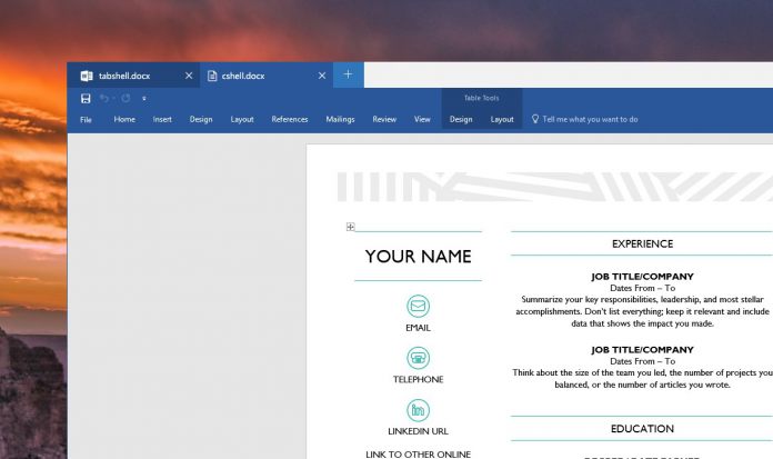
If it makes it into a build, this could be a big feature for productivity. Apple has been using tabbed Finder windows for a while, and this would put the two even in that regard. However, Tabbed Shell may go a step further. Sources suggest it will work with any app window, with no need for implementation by the developer. Despite this, Microsoft will still be offering APIs to devs that want to provide better integration with Tabbed Shell. This would give more control over the experience, such as colors, title, animations, and more. It will also remedy issues with applications that have already have a built-in title bar. In that case, it’s possible minimize and maximize controls would display twice. However, with a few changes, developers would be able to create a much less confusing experience: It’s an exciting idea, but still very much in the early stages. It’s not clear how exactly the experience would work or how it would tie in with combined taskbar buttons. Naturally, it will take Microsoft a while to sort these things out, and sources say it would come with Redstone 3 or 4, if at all. Thankfully, Microsoft has already started on Redstone 3 development, so if the feature ships then we’ll probably hear more soon. The Build 2017 conference is coming in May, so fingers crossed for information around that time.


