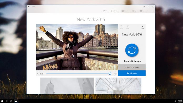
If you are unfamiliar with Fluent Design, it was once known as the Project Neon codename. It is Microsoft’s latest Windows 10 UI that will transform the look of the platform. The company said at Build 2017 that while it will launch with the Fall Creators Update, Fluent Design is actually a UI that will be developed over years. With Windows 10 preview build 16226, Microsoft has made a minor, but noticeable change. A new feature called Reveal Highlight, a new visual effect that is visible when hovering through a list menu. It seems that the design is viewable in UWP applications. By mixing with acrylic, the effect sees a highlighted list menu as the mouse hovers over it. Again, this is a minor tweak, but Reveal Highlight is a further look at what Fluent Design will eventually become.
“The new Reveal Highlight behavior is an interaction visualization that helps guide users. Reveal is now enabled by default on ListView and other XAML collection controls in experiences that target the Fall Creators Update,” Microsoft explained.
Building Fluent Design
Fluent Design appears to take cues older Windows versions and gives a modern twist. The Aero Glass design of Windows Vista and Windows 7 are evident in the new UI. As we mentioned last month, Microsoft is making us of more animations and visual blurring … The blurred visuals and animations allow for a mix of minimalist while offering information to the user. The UI will have close ties to virtual and mixed reality as Windows 10 transitions from 2D to 3D. Scaling across all types of devices and screens is an important part of Project Neon. Again, this is a process that will take years to fully implement. Indeed, Microsoft says the Fall Creators Update will only be “wave 1” of Fluent Design System.


