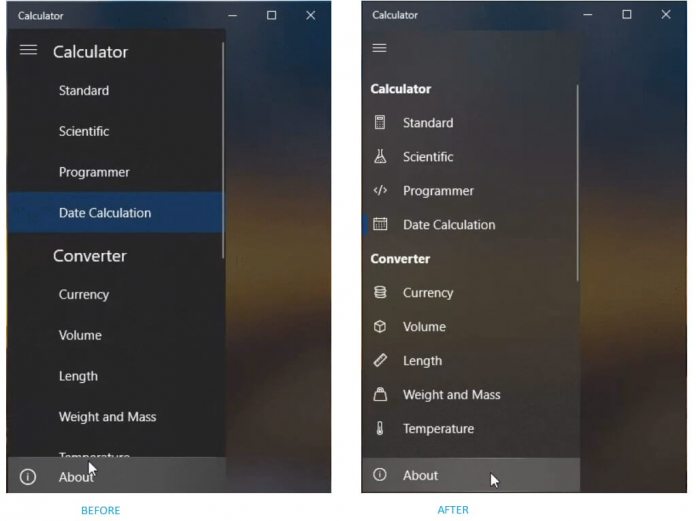
The latest version of the app introduces some UI changes. Currently in testing on the Insider, the update should reach end users soon. At the heart of this update is a new visual design that makes the Calculator look more modern. The improvement is small but noticeable. More importantly, it brings the app up to speed with Microsoft’s general aesthetic plans for Windows 10. Yes, I am talking about Fluent Design, the company’s evolving UI that is introducing elements incrementally. In the Calculator app, we can now see an Acrylic effect, which padding looks sleeker. As for the hamburger menu, Microsoft has included icons next to options. This is visually more appealing and adds an icon next to Standard, Scientific, Programmer, Date Calculator, Currency, Volume, Length, Weight and Mass and Temperature.
Same Functionality
This update is focused on transforming the visual look of the Calculator app. Microsoft has not changed the function of the app. When launched with Windows 10, the application provides a powerful calculating tool including scientific, standard, and programmer modes. These abilities remain intact: “A simple yet powerful calculator that includes standard, scientific and programmer modes, as well as a unit converter. It’s the perfect tool for adding up a bill, converting measurements in a recipe or other project, or completing complex maths, algebra or geometry problems. Calculator history makes it easy to confirm if you’ve entered numbers correctly.” Insiders can update the Windows Calculator now.


